
Cohere: Designing a Digital Ecosystem for Early-Stage Founders and Administrators
A UX/UI case study focused on research-driven design, workflow clarity, and building meaningful connections within startup ecosystems.
At a Glance
Role: UX/UI Designer & Front-End Developer
Team: 3 UX/UI Designers, 4 Back-End Developers
Timeline: 5 weeks
Users: Ecosystem administrators, founders, mentors, investors
Outcomes:
Delivered a fully functional, hand-coded responsive web platform in 5 weeks
Reframed the client's 4-category user model into 5 distinct, research-backed roles that better reflected how participants self-identified
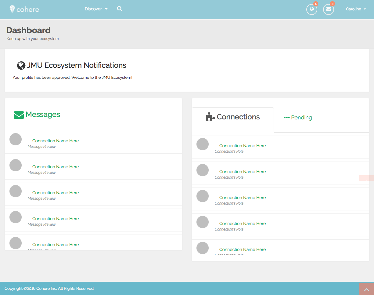
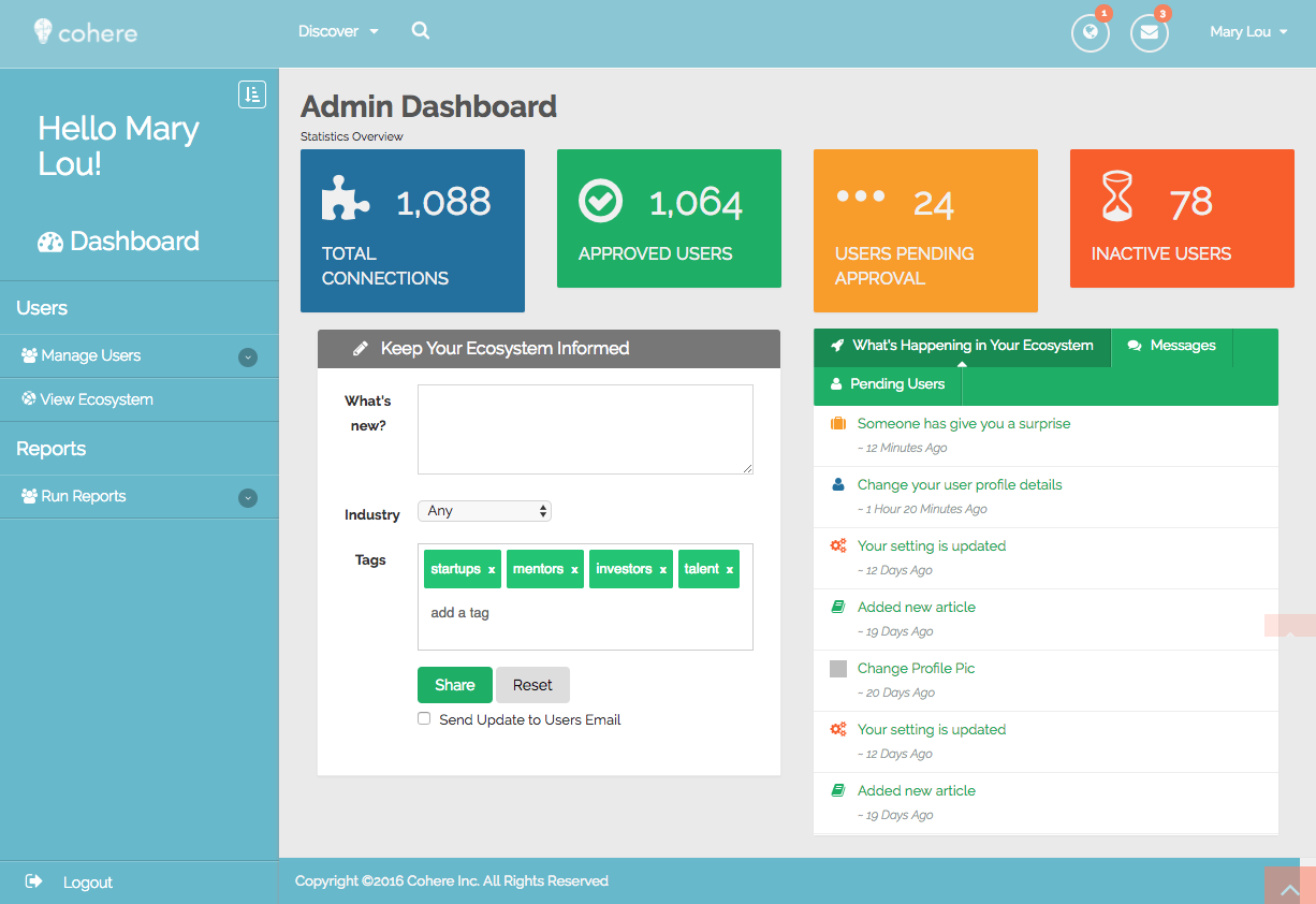
Platform architecture supported 3 distinct dashboard experiences (Admin, Community Member, and Public) from a single codebase
Presented solution to the client (4M Ecosystems) and received award for most thorough and well designed user experience design
Context
4M Ecosystems supports regional startup communities by connecting entrepreneurs, mentors, investors, and resources. Administrators manage large, complex networks, but the existing platform struggled to support discovery, connection, and ecosystem management. Our team partnered with the client to rethink how a digital platform could better support both administrators and community members, resulting in Cohere—a concept for a more intuitive, connected ecosystem experience.


The Problem
Startup ecosystems rely on strong connections between founders, mentors, talent, and investors—but the existing platform struggled to support these relationships in a meaningful way.
While regional administrators managed large and diverse networks, the website was not fluent in organizing ecosystem data, surfacing relevant connections, or helping users understand how they fit into the community. As a result, users had difficulty discovering opportunities, evaluating value, and engaging with others in the network.
From an administrative perspective, the platform lacked the clarity and structure needed to analyze participants, facilitate introductions, and actively manage ecosystem growth. This created a gap between the platform’s intention—to foster collaboration—and the actual user experience.
My Role & Team
This project was completed as part of a senior capstone collaboration between UX/UI designers, media arts students, and computer information systems developers. We partnered with a real client to address an active business problem and deliver a fully functional web platform.
I worked as a UX/UI Designer and Front-End Developer, contributing across research, experience design, and interface implementation. My focus included:
Translating business goals into user-centered requirements
Conducting UX research and synthesizing insights
Defining user roles, flows, and information architecture
Designing wireframes and visual concepts
Supporting front-end styling for a responsive, hand-coded website
This cross-functional structure closely mirrored real-world product teams, requiring constant collaboration between design and development.

Research & Discovery
To understand both the business needs and the experiences of different participants within the ecosystem, our team conducted a mix of platform analysis, user research, and secondary research.
We began by reviewing the existing beta platform to identify usability gaps and limitations in how users navigated and connected within the ecosystem. To better understand the needs and motivations of each user role, we conducted interviews and gathered feedback from professionals involved in startups, mentorship, and talent development, as well as administrators managing ecosystem networks.
Additional research focused on the startup lifecycle and how founders, mentors, talent, and investors evaluate value and engagement at different stages. This helped us design for not just individual users, but the relationships between them.
Research Methods
Platform review and heuristic analysis
User interviews and informal feedback
Secondary research on startup ecosystems and roles
Stakeholder conversations with ecosystem administrators
Research Specifics
To ground our design decisions, we conducted interviews and gathered feedback from founders, administrators, and professionals involved in startup mentorship and talent development.
Key themes that surfaced across conversations:
"I don't know who's actually active." Administrators and participants alike struggled to gauge who was engaged versus who had simply signed up and gone quiet. This shaped our emphasis on visibility signals in profiles and feeds.
"I don't know what I'm supposed to do here." First-time users across multiple roles described uncertainty about their purpose on the platform — which drove our decision to design distinct, role-specific onboarding and dashboard experiences rather than a single universal home screen.
"It's hard to know if someone is worth reaching out to." Trust and credibility were consistent friction points. Users wanted signals of legitimacy before investing in outreach, which informed how we structured profiles and the information hierarchy within them.
Understanding User Roles
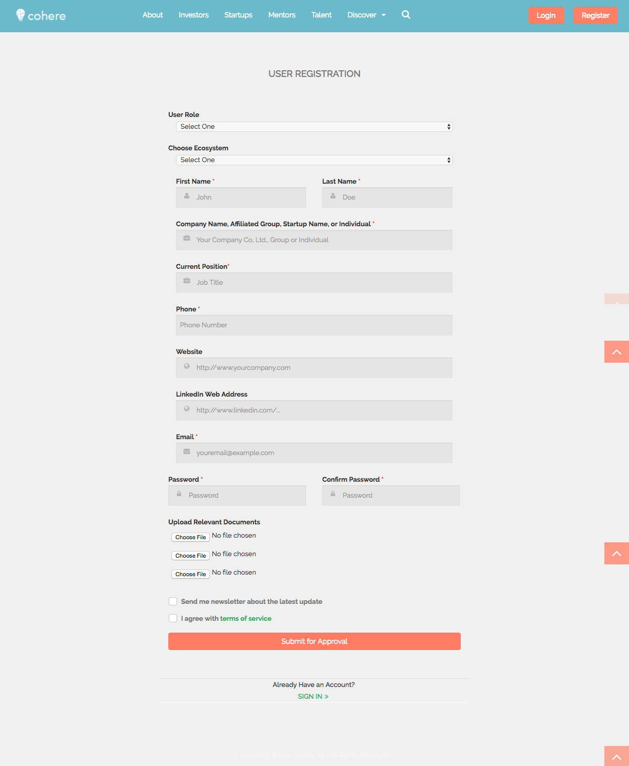
In order to encourage meaningful participation in the ecosystem, it was critical to clearly define who the platform was for and the value each user brought to the network.
Through research and collaboration with the client, we reframed the original “4M” structure—Money, Mentors, Market, and Management—into clearer, role-based user groups that better reflected how people identified themselves and engaged within startup ecosystems.
The final user roles included:
Ecosystem Administrators, responsible for managing and growing regional networks
Startups, seeking resources, mentorship, talent, and funding
Mentors, offering guidance and expertise
Investors, evaluating opportunities and supporting growth
Talent, looking to contribute skills and join emerging teams
This shift in language and structure was integral to aligning the platform with user expectations, clarifying value for each role, and supporting more intuitive navigation and discovery across the site.


Design Goals
Based on research insights, we defined the following goals to guide the design of Cohere:
Improve clarity and visibility for ecosystem administrators
Enable administrators to better understand, analyze, and manage their networks, making it easier to facilitate meaningful connections.Design distinct experiences for different user roles
Support founders, mentors, talent, and investors with tailored experiences that reflect their unique goals and motivations.Reduce cognitive load through structure and guidance
Help users quickly assess relevance by organizing information, surfacing key signals, and providing clear pathways for engagement.Establish credibility and trust across the platform
Ensure profiles and interactions communicated legitimacy and value, encouraging users to confidently connect and collaborate.Balance user autonomy with privacy
Allow users to express their needs and offerings while maintaining control over sensitive information.
Key Insights
1. Administrators needed clarity and visibility across their ecosystems.
Administrators were responsible for managing large, complex networks but lacked tools that helped them easily understand who was in their ecosystem, how participants were connected, and where opportunities for connection existed.
2. Different user roles evaluated value in fundamentally different ways.
Founders, mentors, talent, and investors each had distinct goals and criteria for engagement. Designing a single, uniform experience risked obscuring what mattered most to each group.
3. Users relied heavily on manual interpretation to understand relevance.
Without clear structure or filtering, users were required to mentally sort information to determine whether connections, opportunities, or profiles were relevant to them.
4. Credibility and trust were essential for meaningful participation.
Users needed confidence in the quality of profiles and connections before engaging, especially when considering mentorship, investment, or collaboration.
5. Autonomy and privacy needed to coexist.
Users wanted control over how they presented themselves and engaged with others, while still maintaining appropriate boundaries around sensitive information.
Information Architecture
Design Decisions & Trade-offs
Why Role-Based Navigation Over a Universal Feed
Early in the project, we considered building a single discovery feed for all user types — similar to how LinkedIn surfaces content across roles. We moved away from this for two reasons. First, our research showed that founders, investors, and administrators evaluated the same profiles through fundamentally different lenses. Surfacing one feed risked burying what mattered to each group. Second, the client's ecosystem had real trust dynamics at play: investors needed credibility signals that were irrelevant to talent, and administrators needed management views that community members shouldn't see.
Role-based navigation added implementation complexity, but it was the right call for a platform where the relationship between user types was the core value proposition.
Site Map and Content Inventory


Visual Design Concepts
Typography and Color Scheme

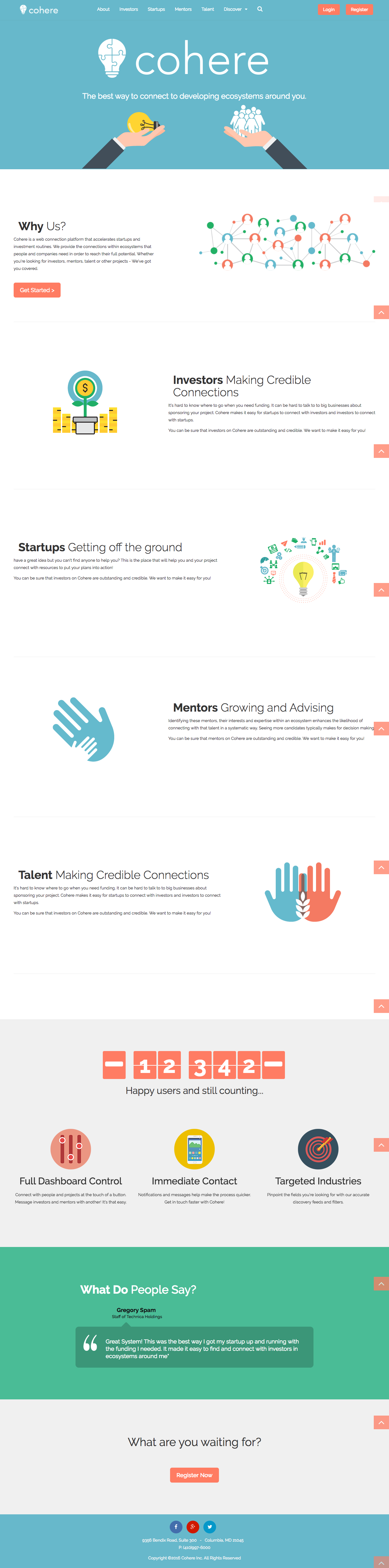
To create a bright and modern feel to the networking site, we chose a soft blue palette with vibrant accents and clean fonts for readability.
Logo Design

After initial discussion with the client about creating a place where each consumer has the ability to connect, we chose the final brand name "Cohere" - find company here and your bright ideas can meet their full potential.
Wireframes to Bootstrap Mockup


Final Solution
The final solution, Cohere, was a responsive web platform designed to support connection, discovery, and ecosystem management across multiple user roles.
The experience centered on role-based navigation, allowing administrators, startups, mentors, investors, and talent to quickly understand their place within the ecosystem and access relevant information. Clear information architecture and structured profiles helped reduce cognitive load and made it easier for users to assess value and relevance.
For administrators, the platform emphasized visibility and control, supporting the ability to analyze participants, manage ecosystems, and facilitate connections more intentionally. For community members, the design focused on credibility, autonomy, and discoverability, enabling users to present themselves clearly while maintaining appropriate privacy.
Visual design decisions prioritized clarity and approachability, supporting trust and usability while reinforcing the platform’s role as a professional yet collaborative space.